Minimalism has become the default visual language for fashion online, but much of what passes for minimal is simply sparse. Good minimal design removes everything that stands between a person and a confident decision. Bad minimal design removes the information they needed to make it.
Restraint with a purpose
The appeal of a pared-back fashion site is easy to understand. Clothes are visual, and a quiet interface lets them carry the page. White space, a limited palette and calm typography signal care and confidence, much as a well-lit, uncluttered shop floor does.
But restraint is a means, not the goal. The goal is clarity: a visitor should always know where they are, what they are looking at and what they can do next. Every design choice in this essay is measured against that standard. If removing something makes the page cleaner but the visitor less certain, it was not clutter.
Whitespace and the grid
Whitespace is not empty space. It groups related things, separates unrelated ones and sets the reading pace. Generous margins around a product image tell the eye where to rest; tight spacing between a product name and its colour options tells it those belong together.
A consistent grid makes that spacing feel inevitable rather than arbitrary. On a category page, the grid does three jobs:
- It makes products comparable. Images of the same proportion, aligned to the same baseline, let shoppers scan a row of tees and compare cut and colour at a glance.
- It creates rhythm. Repeating columns make long catalogues easier to move through, because the eye learns the pattern.
- It adapts cleanly. A grid that drops from four columns to two on a phone keeps its logic. One built from one-off placements tends to collapse unpredictably.
The occasional break from the grid, such as a full-width editorial image between product rows, works precisely because the grid is otherwise strict.
Typography as structure
In a minimal interface, type does much of the work that colour, borders and boxes do elsewhere. A clear hierarchy usually needs only a few levels: a page heading, a section heading, body text and a small supporting style for labels and metadata.
Hierarchy should come from size, weight and spacing together, not from size alone. A product name might be modest in size but set in a heavier weight, with the price beneath it in a regular weight and the colour count smaller still. Uppercase labels with added letter-spacing can mark navigation or categories, but long passages in capitals slow reading.
Line length matters as much as typeface. Body text that runs edge to edge on a wide screen is tiring to read. Keeping paragraphs to a comfortable measure is one of the cheapest ways to make a site feel considered.
Product photography on neutral ground
Neutral backgrounds such as off-white, pale grey or soft stone keep attention on the garment and make a catalogue feel coherent. A few principles keep that coherence honest:
- Consistent light and framing. The same light direction, crop and scale across products, so differences between items are real rather than artefacts of the shoot.
- Accurate colour. A neutral background helps, but only if colour is checked. A navy that photographs as black creates returns, not sales.
- Both flat and on-body views. Flat or ghost-mannequin images show construction; on-body images show drape, length and proportion.
- Close detail. A tight shot of the fabric surface, rib trim or seam tells shoppers far more about quality than adjectives do.
Restrained palettes extend to the interface around the photography. When the site uses one or two neutrals and a single accent for actions, the clothes provide all the colour on the page.
Product pages that answer questions
This is where minimalism most often goes wrong. In pursuit of a clean layout, essential information gets folded into collapsed panels or omitted. Yet the questions shoppers bring to a product page are predictable, and a good page answers them without making anyone hunt.
- Size and fit. A size chart with garment measurements, plus a plain description of the cut: relaxed, regular or close. Model height and size worn give a useful reference. Shoppers comparing cuts benefit from guidance such as how a tee should sit at the shoulder and hem.
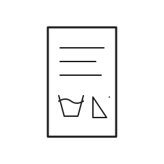
- Materials. Exact fibre content and, where relevant, fabric weight, knit or weave. This is the information a shopper would otherwise read from a garment's care label in a fitting room.
- Care. Washing and drying instructions in words, not only symbols.
- Delivery and returns. Visible near the action button, not only in a footer link.
Collapsible sections are fine for long detail, but the first line of each should be visible. A short summary of fibre, fit and care in plain view, with depth available on demand, respects both the layout and the reader.
Navigation for a catalogue
Catalogues grow, and navigation has to grow with them. A minimal header can hold a surprising amount if the structure underneath is clear: primary categories such as women's, men's and kids', then product types, then filters.
Filters are where a minimal site earns its keep. Size, colour, fit and fabric filters let shoppers reduce a large catalogue to a short list quickly. Showing active filters clearly, with an easy way to remove each one, matters as much as offering them.
Breadcrumbs, a persistent search field and clearly labelled category links are not clutter. They are the quiet scaffolding that lets the rest of the page stay calm.
Accessibility and speed are part of minimalism
A truly minimal site is light in every sense. Fewer scripts, optimised images and a lean structure lead to pages that load quickly on ordinary mobile connections. Speed is a form of restraint that every visitor feels, whether or not they notice the design.
Accessibility follows the same logic. Semantic headings, descriptive link text, visible focus states, form labels and meaningful alternative text for product images all make a site easier for everyone to use, including people using screen readers or keyboards. These practices rarely add visual weight; they mostly add discipline.
Common pitfalls
Several habits recur on sites that look minimal but feel difficult:
- Low-contrast grey text. Pale grey on white looks refined in a mock-up and becomes hard to read on a phone outdoors. The Web Content Accessibility Guidelines set minimum contrast ratios for text, including 4.5:1 for normal body text; treating that as a floor rather than a target avoids the problem.
- Hidden navigation on desktop. A menu icon makes sense on a narrow screen. On a wide one, hiding every category behind it adds a click and removes context.
- Mystery-meat icons. Unlabelled symbols for account, wishlist, search and basket force guesswork. A short text label, or at least an accessible name and tooltip, resolves it.
- Image-only information. Sizes, materials or promotions shown only inside images cannot be searched, translated or read by assistive technology.
- Thin tap targets. Small swatches and close-set size buttons are elegant until someone tries to press one with a thumb.
Each pitfall comes from the same instinct: treating minimalism as a look instead of a discipline. The cleanest page is the one where nothing important is missing and nothing unimportant is in the way.